Hawaii Was Hell Until Ho'oponopono Ke Ala
When Olympic gold medalist Oliver Fix moved to Hawaii, the way he had learned to do things did ...
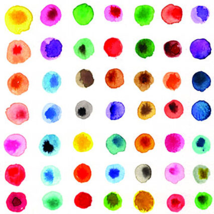
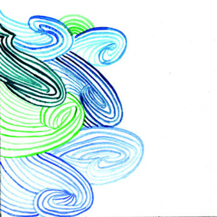
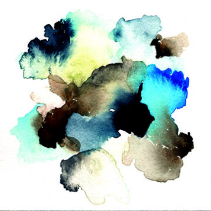
Art courtesy of author/lisasolomon.com
When I began my color meditation practice, I didn’t realize just how powerful it could be. But after years of sticking with it—when I’m my best self, I meditate daily—the practice has shown me how impactful just a few minutes of calm and focus can be. Like many things that are good for us, just showing up can be the biggest obstacle.
I think one of the reasons why I have been able to maintain a color meditation practice over a more traditional one is that I give myself permission to practice for just a few minutes if that’s all I have. When I have the luxury of more time, I may take over an hour to meditate with color, but the benefits of a short practice versus a long one seem equal in my experience.
The last few years have been filled with an excess of anxiety-producing moments. It’s hard to verbalize just how COVID shifted everything—family dynamics, work-life balance, notions of safety—and how it has intensified already stressful normal life experiences. For most of my life I have luckily been able to compartmentalize, acknowledge, and move through day-to-day anxiety fairly smoothly. But the last few years have been no joke. And I’m grateful to have been able to lean into color meditation to help me get through it.
Science has taught us a few things about how our brains interact with color and how we can use color to positively impact our mood. While culture and race do impact some of our responses to color—for example, American brides generally wear white, while Chinese brides traditionally wear red—humans everywhere tend to feel calm when we are exposed to the blue-green spectrum. This reflects our innate connection to nature, which is full of green, blue, and brown surroundings. We also tend to be calmed by tints, which are colors that have a large amount of white (like pastels).
It’s easy to find examples of color psychology in your everyday life. Centers for healing like hospitals and massage studios are usually decorated in tints on the blue-green spectrum to keep us at ease. In contrast, high-intensity locations like fast food restaurants and carnivals employ the use of colors like bright red and neon yellow to keep us alert, active, and eager to buy.
Much like colors on the blue-green spectrum, the element of water has a provable, overwhelmingly positive effect on the body and mind. Simply drinking a glass of water can spark our nervous system’s rest response and provide essential hydration to our cells. The sound of waves can have an immediate and noticeable soothing effect on our heart, mood, and mind.
For me, standing near water always feels grounding. I feel safe and connected—as if I’m a speck of sand in the big beach of humanity. When I slow down, I can almost tune my body into the waves. The wind blows back and forth across my ears, and the fluids in my body ebb and flow. I also feel interested and inspired. Two waves are never the same. The movement, the sound, the endlessness of water (especially the ocean) leaves me awestruck and tranquil.
It makes sense that working with watercolor or gouache is a way to immediately ease our anxiety through combining the healing powers of color and water. I love watching how my water changes colors; how when I swirl the brush in the water the pigment distributes.

In color meditation, you can easily practice wet-into-wet techniques to great effect. This technique is simple: Place a puddle of water on your paper, then drop in a bit of color. Or, try putting a puddle of a color down and drop other colors into it. See what happens when you put a light color down and drop a darker one in. Try three colors—but be warned that the more colors you drop in, the more muddy and brown your dot might become (which could be great!). Place puddles of wet colors right next to each other and let them bleed into one another.

To level up, try painting a mark or shape that relates to the characteristics of water. You may paint small V’s to mimic waves, or delicate lines that peak and link into one another like white caps. While painting, try listening to the sounds of waves. Breathe in time to them. Or tune your breath to your paint strokes—breathe in while you pick up the paint, and out while you make the mark. Try going as slow as possible, breathing deeper and deeper as you go.

Finally, use color to your advantage. Remember that blues, greens, browns, and tints calm the mind. Try using a palette of every shade of blue you can create. Or alternate between turquoise and brown (a favorite color combo of mine). If you haven’t used pastels or don’t think you are a fan of them, try them out—see if there’s a light orange or pink that changes your mind.
Want to keep exploring? Lisa offers an intro to color meditation here.

Get this article and many more delivered straight to your inbox weekly.